
Presentation design: Using icons
Using icons in presentation design helps to create a consistent look and feel across your entire presentation.
Imagery is a great way to represent and support your message. Everybody loves looking at imagery and good use of pictures will succinctly convey information and tap into the emotional side of the brain.
But sometimes it’s difficult to find relevant, high resolution images to use – images that aren’t clichéd or expensive. And what about the time it takes searching for images? We know we’ve definitely spent longer than anticipated searching for images to use in a presentation, and once you finally do find a gallery of images you like, you soon realise how different they all look! Each shot at a different time of day with a different model and mood.
To avoid this frustration, we regularly turn to icons.
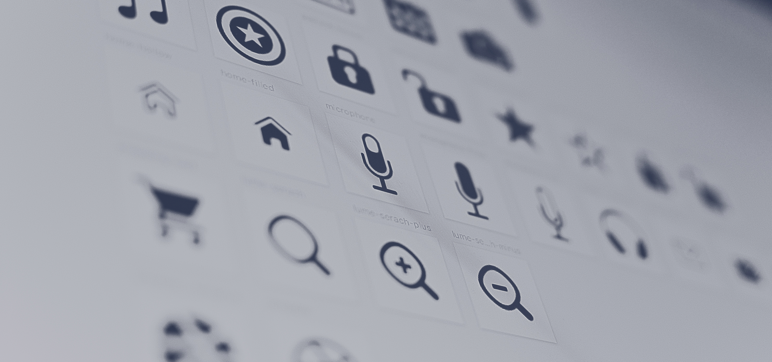
Icons are simple, flat two-dimensional graphics that represent something real. What we love most about using icons is:
- They are a clear representations, with little room for misinterpretation
- If you have a few ideas to present per slide, icons will ensure each are presented consistently (in font and colour). They will align not only the rest of your presentation, but also your brand.
Just this morning one of our clients sent over their presentation draft, full of imagery! Great! But they were all so different and with several used per slide, they became distracting. So we incorporated icons as well as imagery to gain a consistent look and feel in their presentation design.
Learn how to clean up that messy presentation
- A five minute worksheet that helps you pinpoint that
presentations purpose - Transform clutters of information into clear and
defined points - Win over audiences with a compelling visual
presentation